Modern home colour combinations are moving towards warm neutrals, nature-inspired greens, earthy shades and rich statement accents. Instead of relying on stark whites and cool greys, contemporary interiors combine layered colours with natural wood, textured fabrics, stone and metallic finishes.
A well-planned colour palette connects wall shades with flooring, furniture, cabinetry and lighting. Designers often use the 60-30-10 rule, with 60% dominant colour, 30% secondary colour and 10% accent colour, to maintain visual balance.
15 Modern Colour Combinations for Home Interiors
Here are 15 modern home colour combinations, grouped into five design palettes, with practical ideas for using them across different rooms.
1. Warm Earthy Neutrals (Beige, Greige, Caramel and White)
Warm neutrals create an airy foundation for modern interiors. Shades such as beige, greige, taupe and creamy white work particularly well with matte off-white walls, textured limewash finishes, walnut furniture, cane details, boucle upholstery and linen fabrics. These combinations suit living rooms, bedrooms and open-plan apartments.
Four colour combinations to consider:
- Warm Beige + Creamy White: Use beige on main walls and creamy white on ceilings and doors. Add walnut furniture, linen curtains and textured rugs to keep compact living rooms bright and welcoming.
- Greige + Soft Ivory: Combine greige walls with ivory sofas or wardrobes. The mix of warm and cool undertones works well with grey flooring, wooden furniture, and subtle metallic details.
- Taupe + Almond White: Use taupe on a bedroom feature wall with almond white on ceilings and wardrobes. Beige upholstery and brown furnishings add depth without making the room feel dark.
- Sand Beige + Earth Brown: Pair sandy beige walls with walnut or teak furniture, dark wooden cabinetry and natural-fibre rugs. Cane chairs and jute textures complete the organic look.
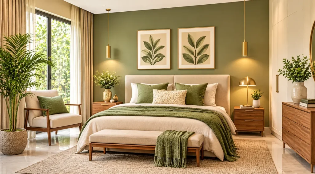
3. Moody Blues and Warm Metallics (Navy, Teal and Brass)
Deep navy, indigo and teal introduce sophistication and visual depth. These shades work well in living rooms, dining areas, home offices and selected bedroom walls. Pairing dark blue surfaces or velvet upholstery with off-white trims, cognac leather, walnut furniture and brushed brass lighting creates a balanced modern luxury aesthetic.Three colour combinations to consider:- Navy Blue + Mustard Yellow: Use navy on a feature wall or sofa, then introduce mustard through accent chairs, cushions or artwork. Off-white curtains and walnut side tables soften the contrast.
- Deep Teal + Soft Sand: Combine teal walls or cabinetry with sand-coloured walls and neutral flooring. Wooden furniture, beige upholstery and brass details complement this palette in dining rooms and formal lounges.
- Deep Indigo + Warm Brass: Use indigo on selected walls in reading corners or powder rooms, complemented by brass mirror frames, pendant lights and cabinet handles. Warm white lighting maintains contrast.
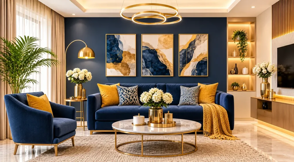
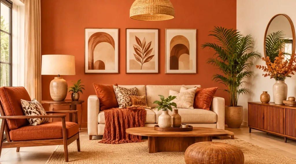
4. Sun-Baked Clay and Terracotta (Rust, Sand Beige and Cocoa)
Terracotta, rust, clay and cocoa brown bring warmth to minimalist interiors. These earthy shades work particularly well with natural stone, wooden furniture, textured plaster and handmade decorative elements. Muted terracotta can be introduced through feature walls or soft furnishings, balanced with sand beige, warm ivory and subtle sage accents.
Two colour combinations to consider:
- Terracotta + Off-White: Apply muted terracotta behind a living room sofa or bedroom headboard, keeping the remaining walls off-white. Oak furniture, cream upholstery, and natural linen complement the clay-inspired shade.
- Terracotta + Sand Beige + Cocoa Brown: Layer terracotta walls with sand beige upholstery and cocoa-brown furniture for a richer dining or living room palette. Wooden tables and textured rugs add depth.
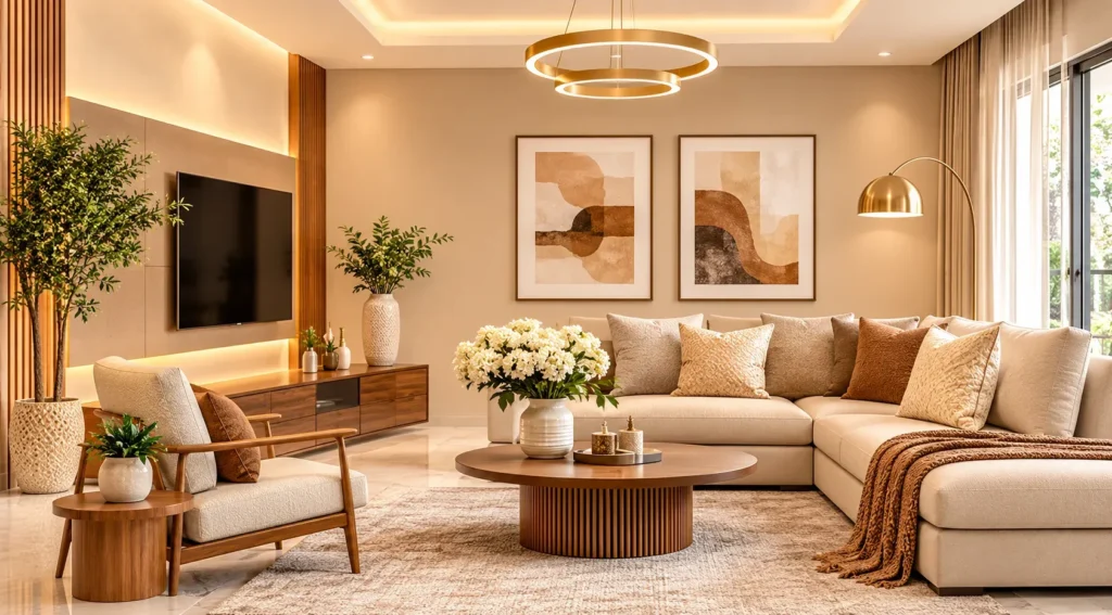
5. Soft Pastels and Muted Neutrals (Dusty Pink, Powder Blue and Ivory)
Muted pastels offer a softer alternative to saturated colours, making them suitable for bedrooms, guest rooms and dressing areas. Dusty pink, powder blue and peach work particularly well with warm grey, linen white, ivory and pale wood finishes.
Three colour combinations to consider:
- Dusty Pink + Warm Grey: Use dusty pink on bedroom walls or an upholstered headboard, with warm grey curtains, stone-coloured rugs and neutral bedding. Light oak bedside tables complete the palette.
- Powder Blue + Linen White: Combine powder blue walls or wardrobe shutters with linen-white curtains and bedding. Pale oak furniture and natural fabrics create a fresh guest bedroom.
- Soft Peach + Ivory: Introduce peach on selected hallway or bedroom walls, balanced with ivory wardrobes and furniture. Light wood finishes and warm lighting complement the soft peach undertones.
Quick Room-by-Room Home Colour Combination Guide
The best colour palette depends on the purpose of the room, available daylight, and surrounding materials. Use these combinations as a starting point when planning different areas of your home.
| Space | Recommended Palette | Finish and Styling Tip |
|---|---|---|
| Living Room | Warm Greige + Olive Green + Walnut | Use matte neutral walls with green upholstery and walnut furniture. |
| Master Bedroom | Sage Green + Warm Beige + Cream | Combine a sage feature wall with beige bedding and soft cream finishes. |
| Kitchen | Sage Green + Warm Off-White + Brushed Brass | Use satin or washable cabinet finishes with light stone countertops. |
| Dining Room | Terracotta + Sand Beige + Natural Wood | Introduce terracotta through a feature wall and balance it with wooden furniture. |
| Home Office | Deep Teal + Pale Sand + Charcoal | Use teal cabinetry with pale sand walls and restrained charcoal detailing. |
| Guest Bedroom | Powder Blue + Linen White + Light Oak | Keep walls soft and introduce contrast through light wood furniture and textiles. |
How to Choose the Right Colour Combination for Your Home
- Follow the 60-30-10 Rule: Use one dominant shade for 60% of the visual palette, a secondary shade for 30% and an accent for 10%. For example, beige walls, olive upholstery, and mustard cushions create a balanced living room.
- Check Natural Lighting: Test paint samples on actual walls at different times of the day. Warm lighting emphasises yellow and brown undertones, while cooler lighting can make shades appear bluer or greyer.
- Coordinate Materials: Match wall colours with flooring, countertops and furniture. Warm wooden flooring complements beige and earthy greens, while grey-toned marble works with greige and muted blue.
- Select Suitable Paint Finishes: Matte finishes create a soft appearance, while satin and washable finishes are practical for frequently used surfaces. Gloss works well for selected trims and decorative details.
- Maintain Colour Continuity: Repeat one or two complementary shades across connected living, dining, and passage areas to create a consistent interior appearance.
Design Your Home Interiors with Shades & Shapes
A well-planned interior brings together wall colours, furniture, lighting, and materials. At SNSS Design, we create residential interiors that balance visual appeal with everyday functionality.
From colour selection and material coordination to furniture execution and turnkey interior design, our team helps bring your home interiors together.
FAQs
Which colour combinations make a small home look spacious?
Warm beige with creamy white, greige with ivory, and powder blue with linen white are suitable choices. Lighter shades help reflect available light and create an open appearance.
Which colour combinations work best for modern living rooms?
Warm greige with olive green, navy blue with mustard yellow, and beige with walnut brown work well in contemporary living rooms.
What is the 60-30-10 rule in interior design?
It uses 60% dominant colour, 30% secondary colour, and 10% accent colour to create a balanced room palette.
Which wall colours complement wooden furniture?
Warm beige, creamy white, sage green, and olive complement natural wood. Dark walnut furniture also pairs well with greige and soft ivory.
Should every room have the same colour combination?
No. Different rooms can have different palettes. Repeating complementary neutral shades and wood finishes maintains continuity throughout the home.